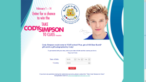
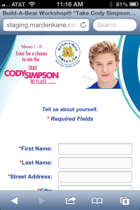
We built a simple sweepstakes as a custom Facebook application a few years ago for a client. The client loved it – until she realized a day before launch that the QR code she had set up to take her mobile users to the application was not working.
“Why isn’t the site working?” she asked in a panic.
The site was working. The only problem was that she had forgotten to mention that she was setting up a QR code to link to the promotion to have mobile users access the Sweepstakes from various retail locations.
“QR codes are not going to work to link to the Facebook promotion URL from mobile devices,” we had to explain. “Facebook is not set up that way.”
Custom Facebook applications, or “tabbed” application, on business pages are set up to work on the web version of Facebook only, and not on the mobile version or on special iPhone or Android or Blackberry or tablet Facebook apps that users typically access Facebook with from those devices. She had not realized that, and had not told us that a QR code, or even a mobile strategy, was part of her plan.
We quickly came up with a solution: we created a mobile optimized page her QR code would take mobile users to off of Facebook. This allowed users to get more information about the promotion and get instructions about how to enter on Facebook the next time they accessed the site on their PCs.
That was years ago and since then we have made mobile optimized promotions with responsive design an integrated, standard part of our custom strategy for clients.
So what does this mean for our Facebook Promotions?
When we scope out a custom Facebook solution these days we make sure our clients understand that a Facebook promotion application will not work on mobile devices or tablets. And if their audience is primarily mobile or tablet users, or a portion thereof, then they need to build a stand-alone web site using responsive design. That way, when a mobile or tablet user clicks to enter, they are directed off of Facebook to a stand-alone promotion page that shows on-screen at the exact width and height for their device.
So what is responsive design?
Responsive design is a creative layout that is structured and programmed to render on screen at an optimal width and format for the device you are viewing. This means that if you are viewing a Sweeps on a PC in Facebook the page renders in the Facebook page at 810 pixels wide, but if you are looking on your iPhone the promotion will render outside of Facebook at 1136 pixels wide. Responsive design automatically adjusts where navigation elements appear or shift around images so the site can be narrow or wide. No more scrollbars and teeny tiny illegible text that users can’t read on their mobile device.
Here are some examples of one site as viewed on several devices.
The next time you are thinking about running a Facebook Promotion, make sure to ask your developer the following questions to ensure your mobile visitors will see the promotion.
How will mobile users get to the Facebook promotion?
If they are planning on building a separate path for mobile and tablet users to access the promotion:
Will you be using responsive design?
How do you test to make sure the Promotion renders correctly on all devices?
If there is no plan for mobile users then you should be ready to discuss other alternatives with your vendor. Whatever the solution, you want to make sure that all of your users who are interested in getting to your promotion are able to access the promotion or are given information on how to enter later, or you run the risk of turning them off for good.


As you mention, responsive design is the way to go, given that mobile is getting more important everyday. An alternative to develop yourself the promo, is to use a 3rd party app.